Aurora Solar
Context
Aurora Solar exists to hit fast forward on a solar future for everyone. With its industry-leading solar design software and end-to-end approach, Aurora Solar’s platform is a one-stop-shop from lead to installation.
Insight
Our challenge was to expand this functional space around accuracy to claim a more ownable emotional space, around our role in leading and setting the industry standard. Building on this positioning, we developed a new Visual Identity for the brand.
Solution
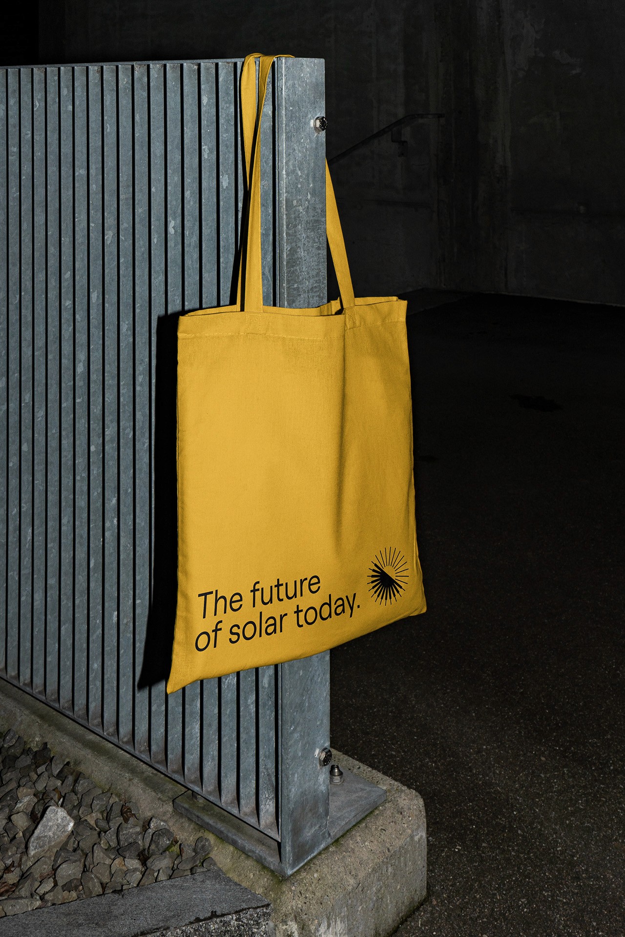
The result is a bold and premium identity that is also dynamic, hinting at Aurora Solar’s ever-evolving nature - constantly innovating to move the solar industry forward and to bring the future closer.
Category:
Strategy
Concept
Animation
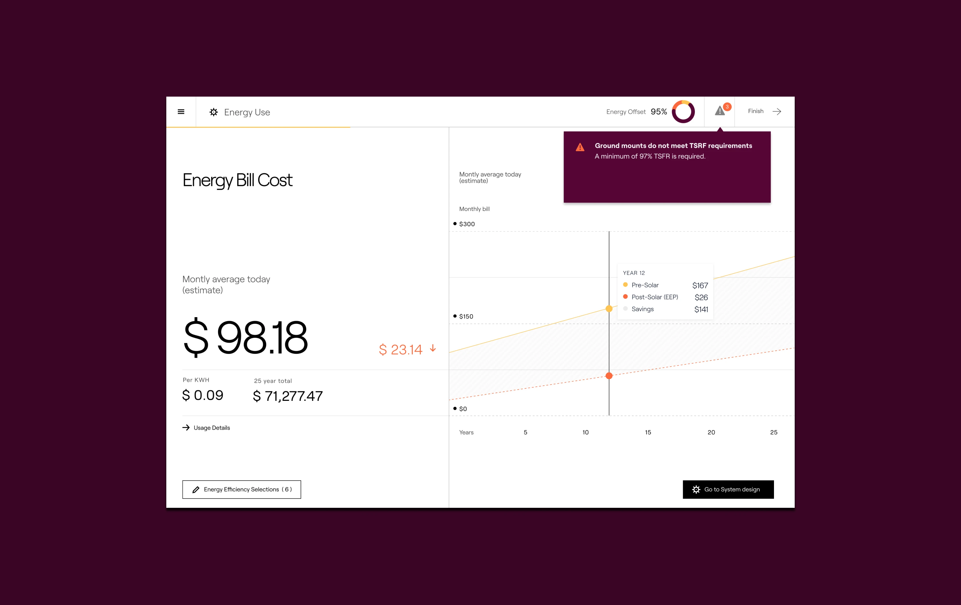
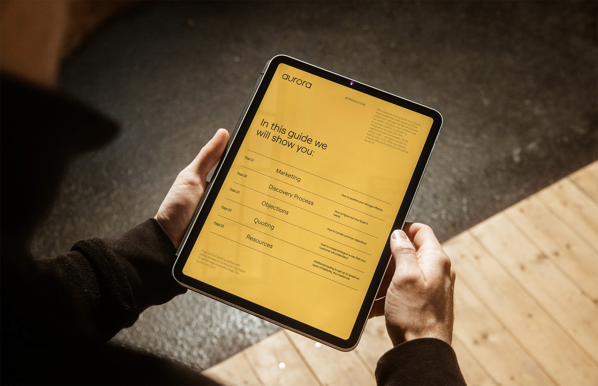
UI


Credits:
Savine van As
Este du Plessis