Netflix
Context
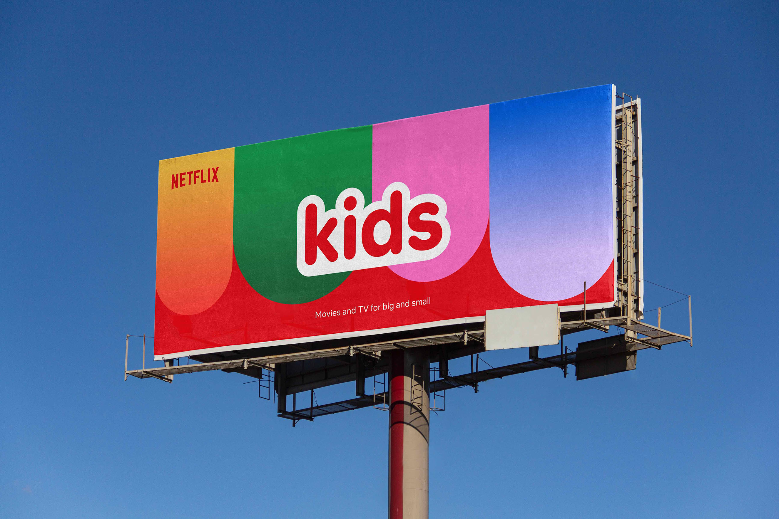
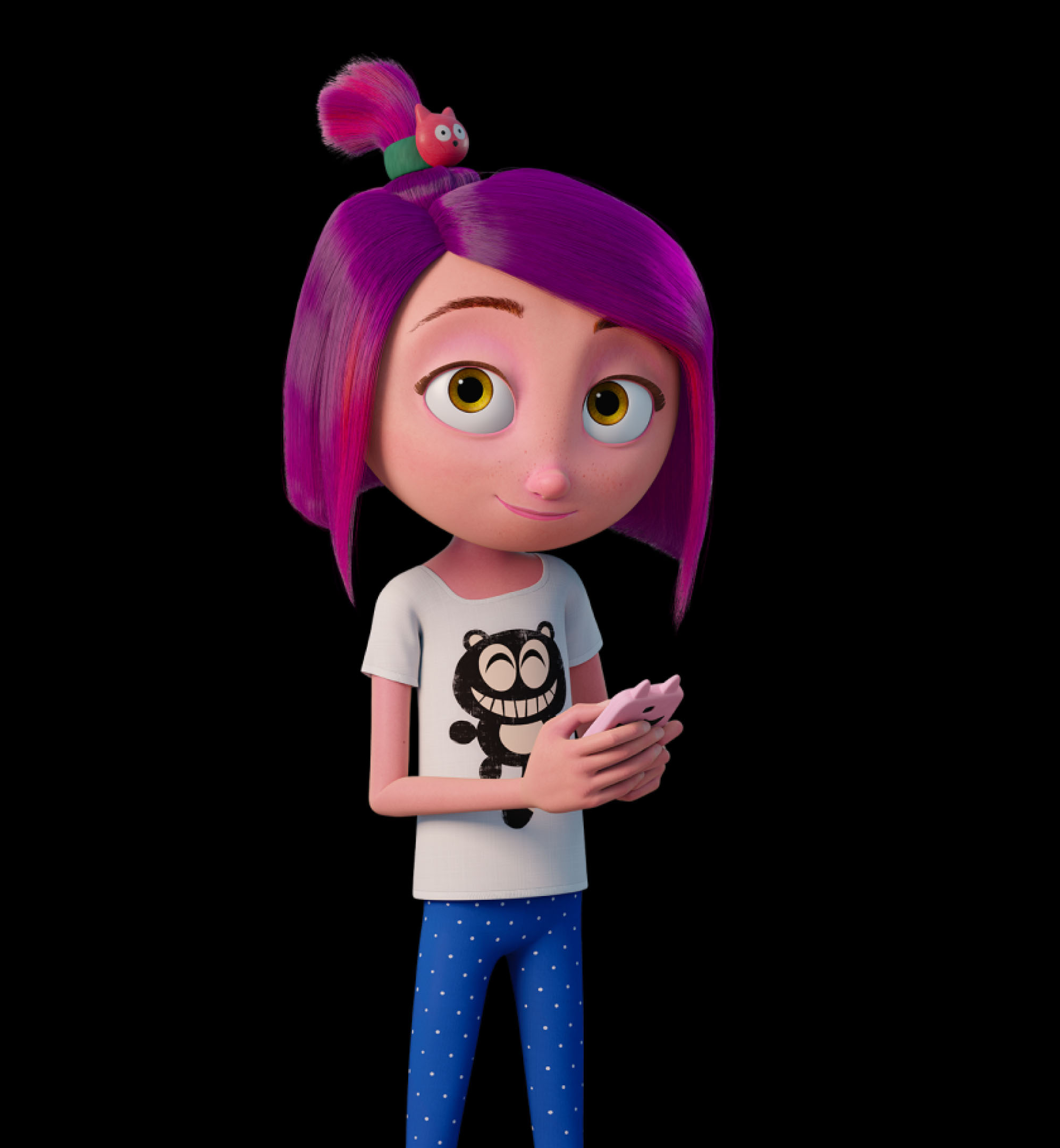
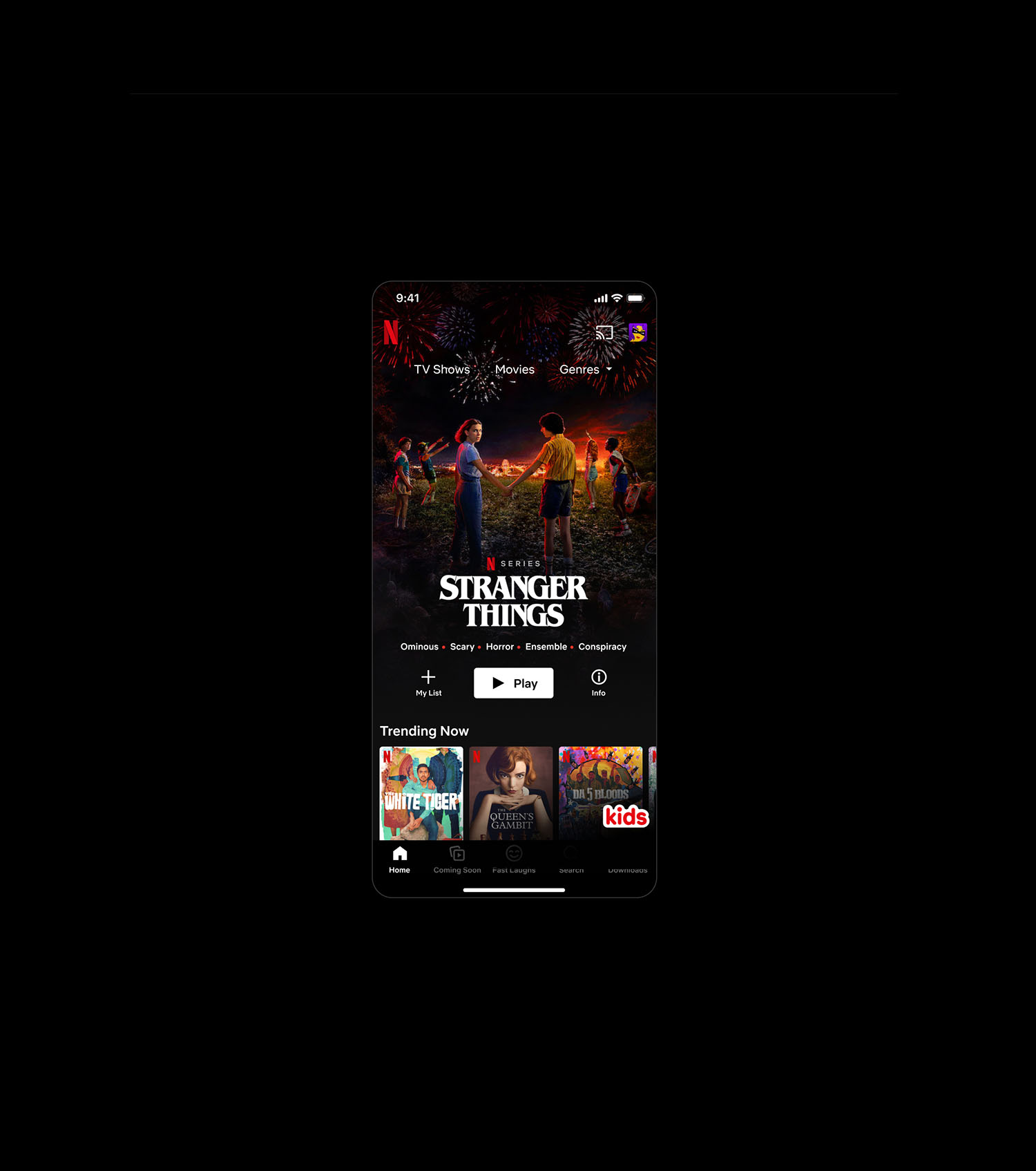
Netflix Kids & Family connects families worldwide with diverse film and series content. The brand collaborated on a unified visual identity and new logos designed to engage age-specific audiences while ensuring the experience feels inclusive and welcoming for everyone.
Insight
To appeal to children while remaining cohesive, the identity needed to balance a sense of adventure with security. The goal was to create a cross-cultural design language that feels unique to the kids' experience yet stays firmly rooted in the parent Netflix brand.
Solution
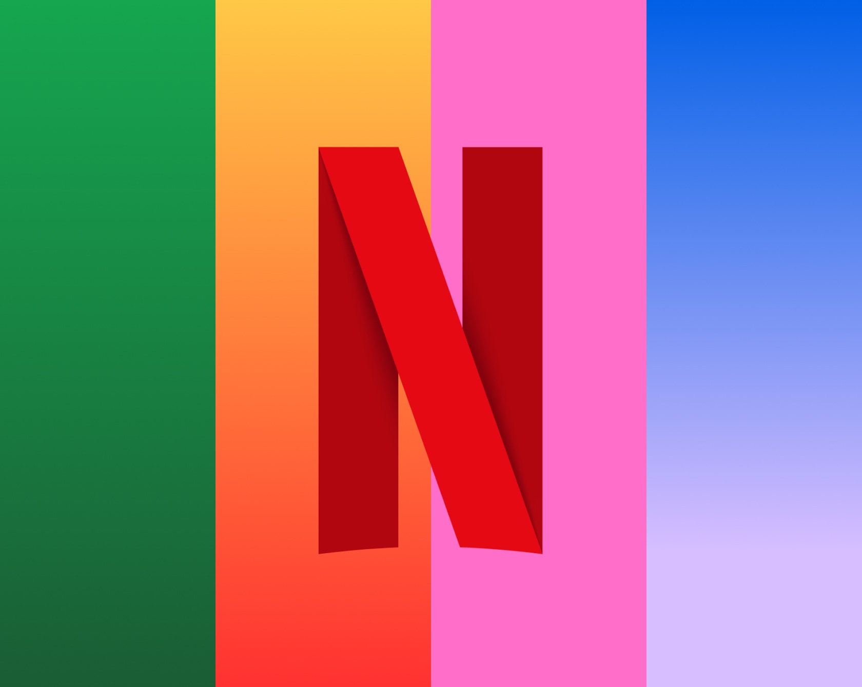
The system uses rounded shapes, vibrant color pops, and a multiplicity of elements to evoke joy. A core feature is the cloud-like stroke, a design language used to interpret the safe space Netflix creates for families across all platforms and cultures.
Category:
Branding
UI
The Netflix Kids logo was redesigned to capture a delightful and adventurous spirit. It incorporates soft, rounded shapes and a cloud-like stroke to symbolize a safe digital environment. This visual mark allows the kids' identity to feel unique and age-appropriate while maintaining a seamless connection to the global Netflix brand.
Credits:
Michal Leonczuk
Ellen Marie Hvam